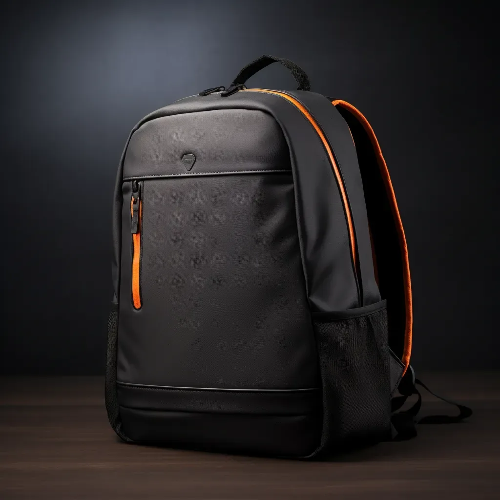
Executive summary: In a bespoke bag collection, colour should be settled before silhouettes are frozen, because three to five disciplined colourways will do more for range cohesion than any number of new shapes. A core palette carried across every style protects your 500-piece minimum per style and colourway, consolidates leather buying into fewer dye lots and gives every category — from totes to small leather goods — a single visual signature. Seasonal accents belong in a second, deliberately small layer, introduced only once the core has proven its reorder behaviour.
Most first collections are assembled rather than designed. A brand commissions a tote in tan, a crossbody in black and a wash bag in something seasonal that looked good on a mood board, then discovers at the photoshoot that the three pieces belong to different houses. The problem is rarely the individual choices. It is the absence of a governing rule that makes those choices comparable. A colour story is that rule: an agreed hierarchy of tones, a specification for how each tone is achieved on each substrate, and a stated reason why each one is in the range at all.
The commercial argument is at least as strong as the aesthetic one. Every additional colourway multiplies the number of purchase orders, dye lots, thread cones and approval samples in the programme. The cheapest way to make a range look broader is usually a disciplined palette, not more patterns. The sections below set out how we develop colour hierarchies with brands, where the tolerance traps sit in leather dyeing, and how to keep a palette intact across seasons once the first delivery has landed.
Programme parameters at a glance
| Parameter | Commitment |
|---|---|
| Minimum order quantity | 500 pieces per style / colourway |
| Sampling lead time | 6–10 working days (12–15 days for complex constructions) |
| Bulk production lead time | 35–50 days after sample approval |
| Inspection standard | AQL 2.5 (ISO 2859-1), single sampling, general level II |
| Incoterms | FOB Xiamen — EXW, CIF and DDP available on request |
| Payment terms | T/T 30% deposit / 70% before shipment; L/C at sight for container loads |
| Verified production floor space | 4,950 m² (SGS-verified) |
| Team | 137 staff across 7 production lines |
| Equipment | 149 machines including computerised saddle-stitch and edge-painting units |
| Monthly capacity | 200,000 pieces |
| Entity | Founded 2014; principal has worked in bag development since 2004 |
What a colour story actually does for a range
A palette is doing three jobs at once. It tells the customer that these pieces belong together, it tells the production team which materials can be bought in volume, and it tells the merchandising team what can legitimately appear next season. When any of those three is missing, the range drifts: either it looks incohesive, or it costs too much to make, or it cannot be extended without starting again. Treating colour as decoration rather than infrastructure is the single most common reason a second season goes wrong.
| Function | Range without a colour story | Range with a colour story | Commercial effect |
|---|---|---|---|
| Recognition | Each style carries its own tone | Two or three tones repeat across all styles | A customer identifies the house from across a room |
| Material buying | Many small lots, each dyed to order | Fewer, larger lots of the same specification | Lower hide cost per unit and better cutting yield |
| Sampling load | Every style sampled in every colour | Core approved once, reused across styles | Fewer physical samples inside the 6–10 day window |
| Merchandising | No logic for the next drop | Clear rules for what may be added or retired | Faster line plan decisions each season |
| Markdown risk | Orphan colours discounted to clear | Core reorders; accents retire on schedule | Less dead stock in the second half of the season |
The practical test we apply during development is simple: place every style in the range side by side, remove one, and ask whether the remaining pieces still read as a family. If removing a piece improves the picture, that piece was carrying a colour nobody else uses, and it should either be recoloured or dropped from the launch.
Choosing the core, secondary and accent tiers
We structure most palettes in three tiers. Core tones carry the majority of units and are reordered every season with almost no discussion. Secondary tones add credible variety and usually sit in neutral or near-neutral territory so they age well in a wardrobe. Accent tones are seasonal, produced in smaller quantities, and retired on a published date. The ratio matters more than the individual colours: a range with six accents and one core will look exciting and sell badly.
| Tier | Share of styles | Typical character | Reorder behaviour | Risk if over-weighted |
|---|---|---|---|---|
| Core neutrals | 50–65% | Black, dark brown, tan, stone | Automatic reorder every season | Too few and the range lacks recognisable anchors |
| Secondary neutrals | 20–30% | Greige, olive, deep navy, oxblood | Selective reorder based on sell-through | Each one adds a hide line and a thread match |
| Signature house tone | 5–10% | A distinctive branded colour | Repeated across categories for recognition | None if genuinely used consistently |
| Seasonal accent | 5–15% | Trend-led tone, rotates annually | Single season, then retired | Dead stock and discounted clearance |
| Capsule or collaboration | Under 5% | Experimental, often with unusual finishing | One-off | Distracts development capacity from the core |
A useful discipline is to name a single signature tone and treat it as intellectual property. It appears on the lining as often as the exterior, on the zip tape, on the edge paint of a card holder and in the print of the care card. Within two seasons it becomes the fastest way for a customer to identify the brand, and it costs nothing extra in development once it is specified.
How colourways interact with order minimums
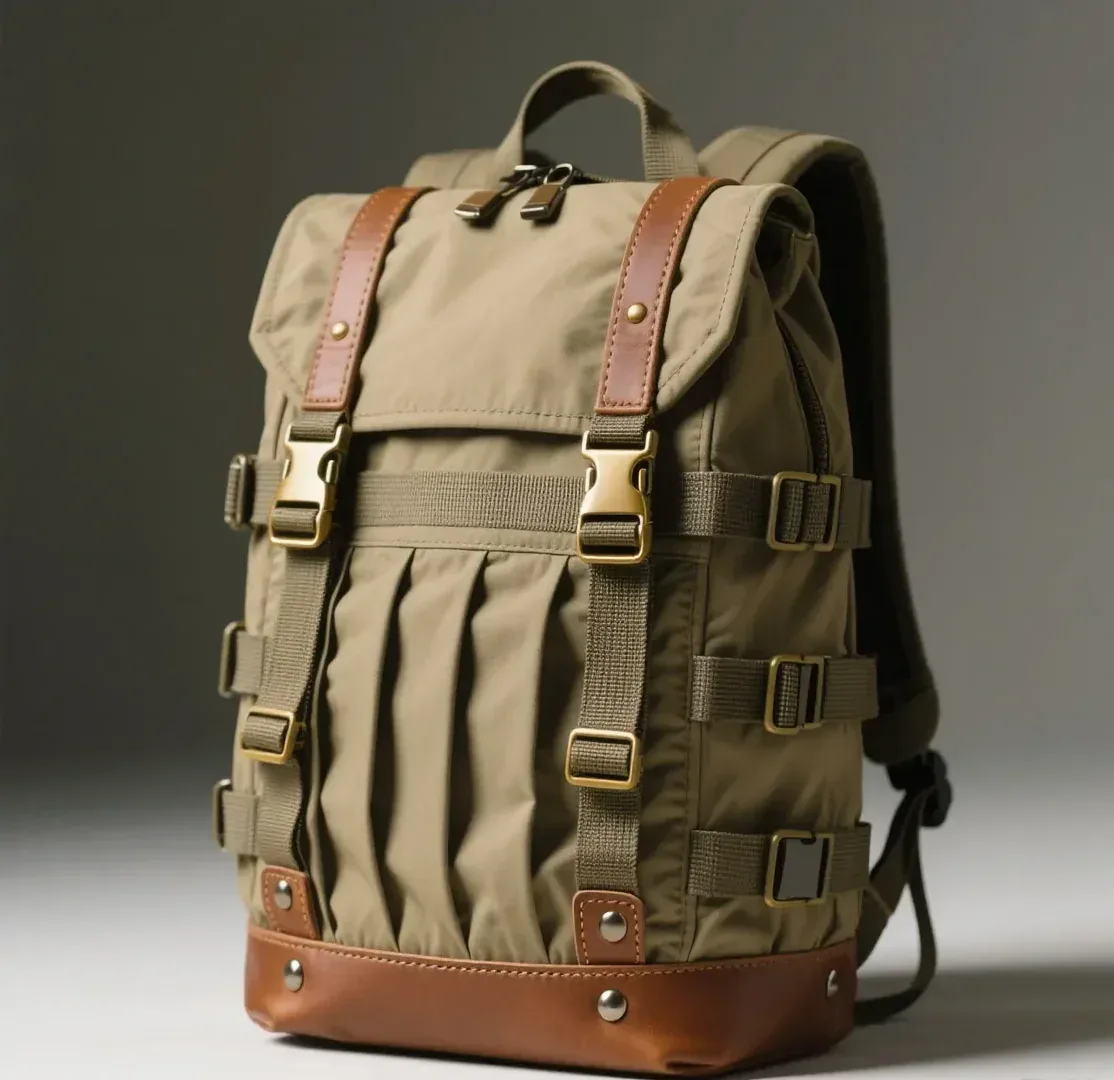
Nothing exposes a weak palette faster than the arithmetic. Our standard minimum is 500 pieces per style per colourway, and every additional colourway is a separate commitment, not a variation of the same one. A six-style range offered in four colours sounds reasonable until it is expressed as twenty-four purchase lines and 12,000 pieces of inventory. The fix is usually fewer colours per style, not fewer styles. We routinely see better sell-through from six styles in two colourways than from three styles in six.
| Range structure | Colourways per style | Purchase lines | Minimum pieces | Comment |
|---|---|---|---|---|
| 6 styles | 2 | 12 | 6,000 | The balanced default for a funded launch |
| 6 styles | 3 | 18 | 9,000 | Workable if two of the three are core tones |
| 6 styles | 4 | 24 | 12,000 | Requires proven demand and split deliveries |
| 8 styles | 2 | 16 | 8,000 | Broader storytelling at controlled inventory |
| 4 styles | 3 | 12 | 6,000 | Suits a focused capsule or boutique launch |
Where a brand genuinely wants breadth, we recommend splitting rather than shrinking. Small-batch pilots let you test an unproven accent at a fraction of the standard minimum and then reorder at scale once the data justifies it. That approach keeps trial out of the main production plan, where it would otherwise consume both cash and line time. Small-batch options are most useful precisely here: colour experimentation without distorting the core buy.
Dyeing and finishing: where tolerance is won or lost
Leather is a natural substrate, and every dye lot varies slightly. The variables a programme team controls are the finishing method and the tolerance standard, and both should be written into the tech pack rather than left to interpretation on the line. Aniline finishes give the richest colour and the greatest batch variation; pigmented finishes give the most consistency at some cost to depth. Understanding which side of that trade you are on prevents most disputes at inspection.
Two practical habits make the difference. First, approve a physical reference swatch and retain two signed copies, one with the brand and one with the programme team; every subsequent lot is judged against it under the same light source. Second, specify metamerism checks where the colour will be sold alongside other materials, because a tone that matches a lining under showroom lighting can separate under daylight. Where dyestuffs are concerned, we work within OEKO-TEX and REACH restricted-substance expectations, which is standard practice for programmes selling into the EU and UK.
Colour beyond the leather: lining, thread, hardware and edge
A collection is judged on its interior as much as its exterior, and interiors are where palettes most often fall apart. The lining has to be specified in a tone that reads deliberately against the shell — matching it exactly looks like a compromise, while ignoring it looks careless. Thread is either invisible by design or deliberately contrast; the unhappy middle ground, a near-match that is slightly off, is what makes a bag look cheap. Edge paint, zip tape and metal finish complete the picture and each needs an entry in the spec.
| Component | Role in the colour story | Specification approach | Common failure |
|---|---|---|---|
| Lining | The most-seen secondary surface | One lining family per shell colour, written into the tech pack | Lining dyed to match but reading as a different tone |
| Thread | Either invisible or a declared contrast | Two thread references per colourway: one tonal, one contrast | Third-party substitution of a near-match spool |
| Zip tape and teeth | Visible on many silhouettes | Tape dyed to order or chosen from a house range | Stock black tape used against a brown shell |
| Edge paint | Frames every panel | Mixed to the shell, matte sheen unless gloss is specified | Edge fading lighter after a few weeks of handling |
| Hardware finish | Sets the temperature of the whole piece | One plating family, with a defined salt-spray expectation | Gold and gunmetal used interchangeably across styles |
| Logo treatment | Usually tonal within the palette | Blind deboss or tone-on-tone print for house lines | A large bright logo fighting the colour story |
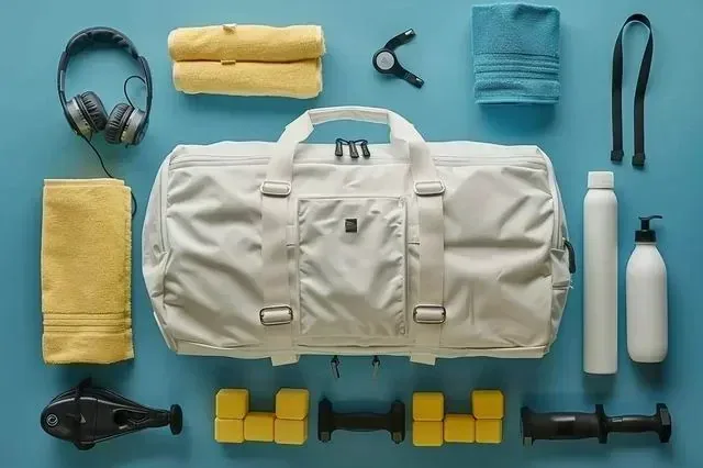
Running one story across several categories
The harder a palette has to travel, the more rigor it needs. A colour that behaves beautifully on a full-grain tote may look hollow on a coated canvas backpack or impossible on a microfibre wash bag, because each substrate absorbs dye differently. Rather than pursuing an unattainable perfect match, the practical goal is a family resemblance: the same temperature, the same depth, a recognisable relationship between them. Buyers accept that leather tan and canvas tan are not identical; they do not accept that one looks warm and the other grey.
| Category | Typical expression of the colour | Watch point |
|---|---|---|
| Totes and shoppers | Large panels show the full character of the hide | Batch variation is most visible here; buy panel leather from one lot |
| Crossbody and small bags | Colour is seen close to the face and in daylight | Watch how the tone shifts against skin and clothing |
| Business and briefcase | Dark tones dominate; polish matters more than novelty | A black and a near-black should never both appear in one range |
| Travel and holdalls | Large areas plus straps, webbing and binding | Webbing is often the worst-matched component in the range |
| Evening and clutch | Satins, metallics and Exotic-effect finishes | Accents work here even when they would not in day carry |
| Small leather goods | The same tone in miniature, often retail-adjacent | Small pieces are compared side by side at the counter |
| Desk and corporate pieces | Dyed consistently because they sit together on a surface | Backing materials can telegraph colour unevenly |
Where a collection spans both leather and performance fabrics, we advise locking the leather first and then selecting fabrics against it, because the dyed leather has the narrowest achievable tolerance. Trying to work in the opposite direction means asking tanneries to match a piece of synthetic fabric, which is slower, more expensive and rarely perfect.
Testing colour before you commit
Colour complaints are among the most expensive after-sales problems in the category, because they usually surface only once the customer has used the bag. Four checks before bulk release remove most of that risk, and none of them requires elaborate equipment. They belong alongside the dimensional and construction checks already written into the inspection plan, so that colour is assessed as a specification item rather than a matter of taste at final packing.
| Check | What it reveals | How it is judged |
|---|---|---|
| Dry and wet rub fastness | Whether dye transfers to clothing | Against a standard white cloth; no visible transfer acceptable |
| Light exposure | Fading on pieces displayed near windows | Controlled exposure alongside the retained reference swatch |
| Migration onto lining | Dark shell marking a light interior | Contact test under warmth and pressure |
| Batch-to-batch comparison | Drift between production lots | Every new lot compared to the signed standard under one light source |
| Perspiration and moisture | Discolouration at handles and straps | Relevant for pale tones and suede; specify accordingly |
Because our standard inspection regime uses AQL 2.5 (ISO 2859-1) with single sampling at general level II, colour variation that falls outside the agreed tolerance is treated as a defect class in its own right. That is the mechanism by which a subjective judgement becomes an enforceable one, and it is why writing the tolerance into the specification matters more than choosing the colour itself.
Keeping the story intact across seasons
The second season is where palettes usually unravel. A supplier offers a beautiful new hide, a retailer asks for something brighter, a single strong seller encourages a brand to extend a tone that was never meant to carry weight. None of these is a bad decision in isolation; collectively they turn a coherent house into a catalogue. The defence is a short set of governance rules, written down, that survive staff changes and seasonal pressure.
- Publish the palette: one page listing every approved tone with its material reference, tannery article number and thread pairing, updated whenever a season closes.
- Freeze the core for at least two seasons so that reorders and replacements are always possible for customers who bought in year one.
- Cap accents explicitly — no more than two new trend tones per drop — and give every new accent a retirement date at the moment it is approved.
- Archive physical references for every approved colourway, stored away from light, so that a reorder in year three can be matched rather than guessed.
- Review sell-through by colourway, not only by style, before extending anything; a colour that sells slowly does not improve with more styles behind it.
- Re-approve any component change, including thread or zip tape substitutions proposed for cost reasons, against the original swatch.
Brands that follow those rules find the third season dramatically easier. Material libraries accumulate, patterns are already cut in proven colours, and the line plan becomes a conversation about what genuinely deserves a place rather than a negotiation about whether everything can be made. Colour stops being a recurring problem and becomes the cheapest expression of brand identity in the range. Further reading on how material choices interact with a palette sits in our guide to luxury leather materials.
Build your palette with us
Send us a mood board, three reference colours and your target price bands. Our programme team in Quanzhou will return a tiered palette proposal with the matching thread, lining and hardware references, then develop the first styles against it. Email service@junyuanbags.com or WhatsApp +86 177 5002 0688.
Frequently Asked Questions
How many colours should a first bespoke bag collection include?
Three to five is the workable answer: two core neutrals that appear on nearly every style, one or two secondary tones for variety, and a single seasonal accent if the brand wants something timely. That spread keeps the range cohesive while staying inside reasonable commitments, since the minimum applies per style and colourway. More colours dilute the buy, extend sampling and leave slow-moving inventory that ends up discounted.
Why do leather colours vary between batches?
Because hides are natural and absorb dye differently depending on the animal, the season and the tannery's water and process conditions. Even a well-controlled tannery produces measurable drift between lots. Pigmented finishes reduce the variation substantially; aniline finishes show the most. The practical control is a signed physical reference retained by both sides, with each new lot compared against it under a single agreed light source before the bulk cutting begins.
How do you match a lining colour to a leather shell?
The safest approach is a deliberate relationship rather than a perfect match. Either choose a lining one step lighter or darker than the shell so the contrast reads intentional, or repeat a signature house tone inside every bag. Trying to match a dyed leather exactly with a woven lining almost always produces a near-miss that looks like an error. Specify the lining reference in the tech pack and approve it physically, alongside the shell, in daylight.
Does dyeing leather to a custom colour cost more?
Custom colour usually adds cost in two ways: tannery minimums for a bespoke dye lot, and development time to reach the target shade. Both fall sharply when the colour is repeated across several styles, which is why we advise concentrating colour development on a few house tones rather than spreading it thinly. Using an existing tannery shade card is cheaper and faster, but it also means another brand somewhere can order the same colour.
What is the best way to introduce trend colours without taking inventory risk?
Put trend tones into a small-batch pilot rather than the main production plan, so unproven colours are tested against real demand before they absorb cash. Alternatively, apply them where the unit commitment is naturally smaller: linings on a popular style, a seasonal small leather good, or one accessory in an existing range. Both approaches let the range look current while keeping the main buy concentrated in proven core tones.
How do you handle colour across leather and fabric in one collection?
Lock the leather reference first, then select fabrics against it. Leather has the narrowest achievable tolerance and depends on a tannery lot, whereas woven fabrics and coatings can usually be adjusted to sit alongside it. Working in the opposite direction asks a tannery to chase a piece of synthetic cloth, which takes longer and costs more. Aim for family resemblance rather than an impossible exact match: the same temperature and depth will read as deliberate.
Which colour mistakes most often reach bulk production?
Three dominate. A near-match thread substituted for the specified reference, stock zip tape used in black against brown shells, and webbing or binding chosen from a standard range rather than dyed to the palette. All three are component-level decisions taken late, often for speed or cost, and all three are visible in product photography. Writing each component reference into the tech pack and re-approving any substitution closes the gap in most programmes.
Should hardware finish follow the colour story?
Yes. Hardware sets the temperature of the whole piece, so pale gold with cool greys or bright chrome with warm tan both read as unresolved. Choose one plating family early — light gold, brushed nickel, gunmetal or palladium — and apply it across the collection, reserving any departure for a defined capsule. If you genuinely want two families, separate them by category rather than mixing them within one range so the choice looks deliberate.
How does a colour decision affect sampling time?
Standard sampling runs six to ten working days, extending to twelve to fifteen for complex constructions, and colour development can add to that whenever a custom dye lot must be prepared before cutting. Confirming core colours early, ideally before the first tech pack is finalised, keeps the clock inside the standard window. Requesting a new bespoke shade during the sampling round usually resets part of the process and should be avoided if the launch date is fixed.
Can a colour be repeated across different categories such as bags and desk items?
It can, and doing so is one of the strongest and cheapest brand signals available. A single house tone carried from a tote to a desk pad to a card holder makes unrelated categories look like one programme, which matters particularly for corporate gifting where recipients see several pieces together. The requirement is a single specified reference and a retained physical swatch shared across every category so each supplier is matching the same standard.
What tolerance should be written into a colour specification?
Avoid vague language such as 'close to sample'. Instead specify that each production lot must match the signed reference within visible limits assessed at an agreed distance and light source, and pair that with performance expectations: no transfer in dry and wet rub testing, no migration onto light linings, and acceptable light-fastness for pieces displayed near windows. Expressing colour this way makes it enforceable during inspection rather than arguable afterwards.
How often should core colours be changed?
Rarely. Core tones should stay in the range for at least two seasons, and often for years, because customers replacing or adding to an earlier purchase expect continuity. Change belongs in the seasonal accent layer, where novelty is welcome and retirement is planned. If a core tone genuinely underperforms, retire it deliberately and communicate the change, rather than letting it disappear quietly and leaving customers unable to match what they already own.
Does a dark lining hide poor interior construction?
It hides stains and wear, which is why dark linings suit high-use travel and business categories, but it also makes the interior feel smaller and harder to search in daylight. A mid-tone lining is usually the better compromise for handbags. Whatever the tone, construction quality still shows through seam allowances, pocket attachment and how cleanly the lining sits at the mouth, so colour should never be used to compensate for finish standards.
Are there compliance considerations for dyed leather?
Yes, particularly for programmes selling into the EU and UK. Dyestuffs and finishes fall within REACH restricted-substance expectations, and OEKO-TEX standards are widely used to evidence that a material is free from harmful levels of specified substances. Tannery choice matters here: sourcing from Leather Working Group audited suppliers gives traceability and considerably simplifies due diligence. Ask for the documentation at sampling stage rather than after the bulk has shipped.
Why does my bag look a different colour in photographs than in person?
Usually metamerism, where two surfaces match under one light source and separate under another, compounded by camera white balance. It is common with dyed leather against coatings or metallic hardware. Assess colour under daylight, retail lighting and warm indoor light before approving, and shoot commercially under controlled conditions. Specifying a slightly more pigmented finish reduces the effect, since heavier pigment tends to stabilise how a surface reflects different wavelengths.
What is a practical way to archive colour references?
Keep two signed swatches for every approved colourway, cut from the actual production lot, one with the brand and one with the programme team, stored flat and away from light. Record alongside each swatch the tannery article number, dye reference, finish description, thread pairing and date of approval. A physically archived library shortens every subsequent reorder, because a new hide can be compared directly rather than described in emails across three time zones.